I tuned into Elizabeth Murray during the 1980s when she was well into her career as a known artist and teacher.
Elizabeth Murray shown with SENTIMENTAL EDUCATION, 1982
I was making my own paintings in a fifth floor walk up apartment on lower east side of New York.
Standing with work in East Village, NYC tenement – 1983
I was eager to see what living artists were doing beyond the ones from earlier generations that I had looked to for inspiration. There were so many exhibitions just a walk or subway ride away. While the male art stars of day were getting much of the attention (Schnabel, Salle, Clemente, Haring, and others), I was especially interested to see the painting by contemporary women who were also receiving cover stories in ART NEWS.
I took so much from the new image gestural works of these three during that decade. By the early 1990s, I was moving in different directions–looking more within and not as attentive to art world celebrity, but I know that each of their work evolved in exciting ways.
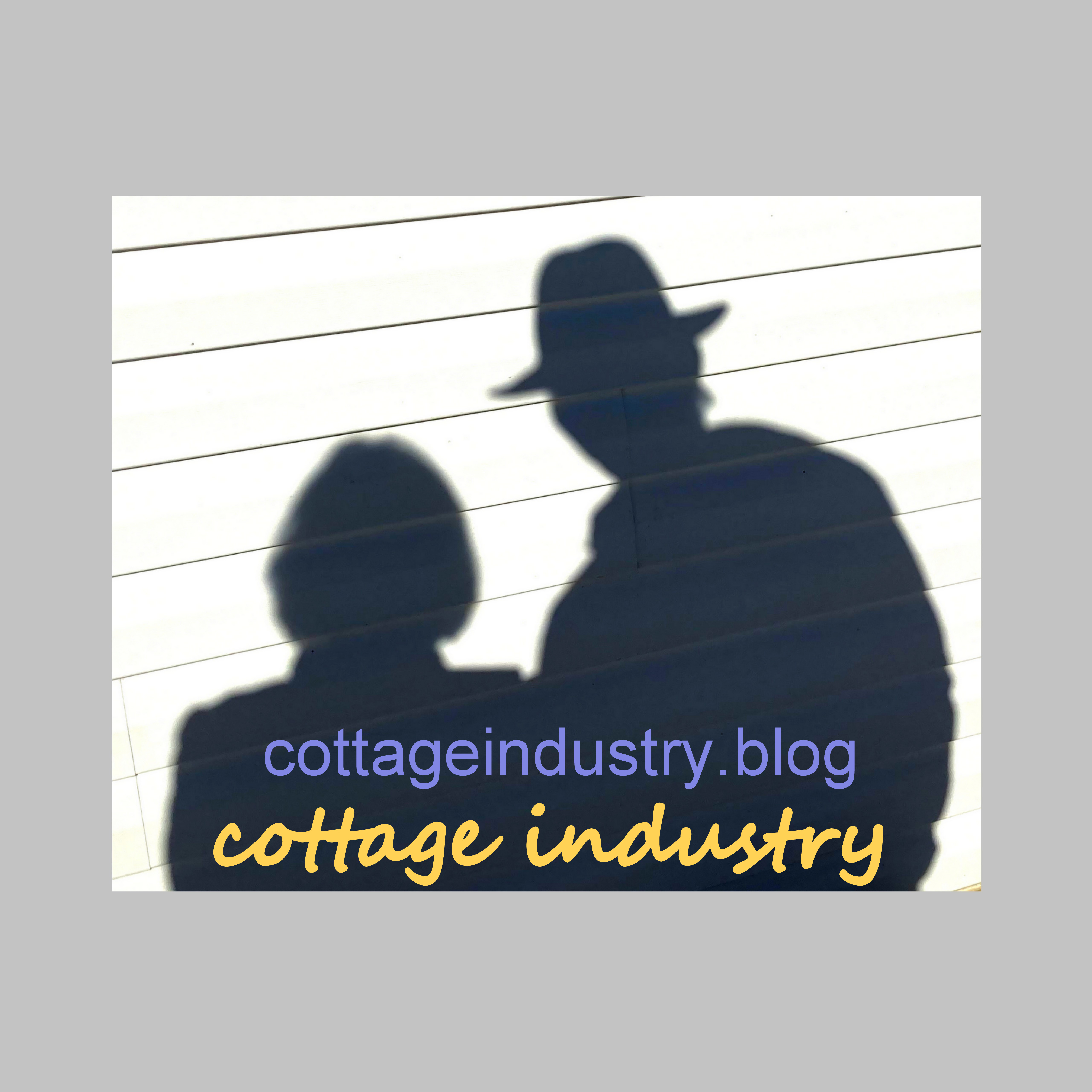
My Favorite Icons from the 1980s
I finally got over to see Elizabeth Murray Back in Town, the exhibition on view until October at the Anderson Gallery in Buffalo. Her shows in New York during the 1980s were a big inspiration to me. The expressive shapes and colors that went beyond painting as the formed canvases emerged.
FLYNG BYE, 1982
I had never seen the earlier works. In the late 1960s, the paintings have an Asian sensibility (something I like a lot) . . .
O-O-O UR’LL NEVER GET TO HEAVEN (detail), 1969
Buffalo is fortunate to have access to this exhibition. Lots more to see there, as I am highlighting just a couple works here.
Standing before such a strong “last painting” is a rare moment. Everybody Knows (September 2007) is poignant and playful. She likely knew well that this one would be her last. The physicality of this one work is staggering despite any loss of energy.
EVERYBODY KNOWS, 2007
It felt like a personal loss to learn of Elizabeth Murray’s passing in 2007 at 66 and again last year when I read Susan Rothenberg’s obituary after her death at age 75.
Susan Rothenberg shown with ROSE, 1980
That is when I googled Louisa Chase and learned that she too had died early at age 65 in 2016. They are all gone now, but their work lives on. That part of mortality is especially sweet for artists with a strong following.
Louisa Chase shown with THE LIGHT, 1983-84
I’m pretty sure Louisa had an ART NEWS cover too, but I did not find that one. I happen to have a small collection from the era.
There are plenty of artists in the last couple decades that are worthy of icon status, but that is for another post.
This collage of images featured at the top of the post:
Top, left-to-right–Georgia O’Keefe, Frida Kahlo, Helen Frankenthaler
Bottom, left-to-right–Yayoi Kusama, Lee Krasner, Amy Sillman, Joan Mitchell
~~~~~~~~~~
COPYRIGHT PAT PENDLETON 2021–ALL RIGHTS RESERVED. Find out more at patpendletonstudio.com / timraymondstudio.com
Before Angola, we were in Buffalo–before that, P was in Denver and T was in Virginia.
Before that, P was in New York and T was in Austin.
Before that, P was in San Francisco and T was in New York.
This mapping can go on and on, but the point is that so much begins to layer onto the story of individual experience. Artists with long careers go through so many phases with separate bodies of work within different circles of friends, jobs, surroundings. While listening to an interview with Ethan Hawke recently, he commented on his career has been more of a more of a careen and spoke about how arriving at authentic expression requires that sort of twisty road.
I once heard someone refer to parallel drift, another version of this phenomenon. Think of a Rumba vacuum sliding about the surface of a room gathering material here and there.
Part of our cottage life has been frequent trips down to the shore, just blocks away. The local beach is fairly unimpressive. There are plenty of nicer beaches nearby along the lake, but this one is just right for taking a quick breath of the waterside experience. The water and shoreline are different every time we go–calm and clear with a sandy bottom some days and other days the rolling waves bring in more stones and seaweed. After the heavy rains and winds of late, we find piles of wood washed along the shore and rougher waves delivering sticks and chunks of wood, along with various debris and dead fish bobbing up as seagulls circle above.
Painting again–after my year of #notpainting due to my preoccupation with the pandemic and world chicanery, along with moving and settling in–is much like this changing beach experience. Each time I pick up the brush something entirely different wants to come through. It took me six months of living here to set up my studio properly and begin to work there.
Tim’s is there too, separated by a curtain.
Studios separated by a curtain–T on right, P on the left
He pointed out an article about a former Cooper Union teacher from the 1970s–the article by John Yau on Hyperallergic about a recent Andrew Forge (1923-2002) show at Betty Cunningham Gallery in Manhattan focused on how the painter completely changed the way he was working at one point when he moved from Europe to the U.S. and left representational painting behind to create work with dots and lines only. Yau reports:
“He went from being a perceptual painter who based his work on what was in front of him to being a painter of perception focused on what he was putting in front of himself.”
Create something that has not been seen before in order to take in what it evokes. This is how my work comes about. Forge’s narrowing of the parameters seemed to open up possibilities–not a new idea, but good to remember. I was doing this a few years ago when I limited myself to striations of color, texture, and pattern.
-Pat Pendleton – DISTANT SIGHT, 2017 – acrylic on paper, 30 x 22 inches
A lot of this work is featured in this catalog, a 52 page softcover book (full preview in link). from our 2017 exhibition The Future of Something . . .
Around the time of this show, I was starting to tune into New York Magazine art critic, Jerry Saltz. I felt some confirmation for painting stripes when I read this:
“All art is political because within every contemporary artist is the deep content of this time and all of that is in their work, even if it is just stripes or squiggles done unoriginally, in a fever with insight.”
Recently, he posted something else of interest:
“You already have a style; your own style. You do not have to create one. Your style is one of the greatest tools you have to say what you have to say.”
He later added; “Style is cultivated–it does not grow naturally.”
I would replace style with voice, but it seems that is the task of any artist is to allow movement and change to occur in different ways so that a continuity in style/voice is arrived at no matter what it is.
John Seed mentioned in My Art World: Recollections and Other Writing (2019), something once said by Philip Guston in a conversation about “studio ghosts”:
“When you’re in the studio painting, there are a lot of people in there with you–your teachers, friends, painters from history, critics . . . and one by one they walk out and if you are really painting, you walk out.”
That said, paintings can have a mind of their own…
Pat Pendleton TRICK MIRROR, 2021 48 x 32 inches acrylic and collage on canvas
The title, Trick Mirror, is taken from the Jia Tolentino’s 2019 book title, a collection of essays on self-delusion.
~~~~~~~~~~
COPYRIGHT PAT PENDLETON 2021–ALL RIGHTS RESERVED. Find out more at patpendletonstudio.com / timraymondstudio.com
Many of my paintings include collage aspects of cloth or paper–at least at the start. I often end up covering over most of these images with paint as the work evolves.
The 1950s were a time of patterns on walls, patterns on furniture, and patterns on clothing. Anyone coming of age now may not grasp how surroundings mold aesthetics. As a girl growing up in those years and into the 1960s with the bolder Carnaby Street and Psychedelic colors and patterns of that time, I was marked. The bold pink roses on the walls of my bedroom closet, the leafy green and gray bark cloth sofa and chair in the living room, and various items of clothing stick with me like a familiar fragrance. The dress I wore for a piano recital when I was in third grade had a black sleeveless top and full white skirt decorated with ripe apples. My first pair of jeans in seventh grade were olive green with pink-centered white daisies, and I went off to college with red, white, and blue striped hip hugger bell bottoms that I sewed using a Simplicity pattern.
Sewing was my gateway to the world of making things in the art realm. I began incorporating textiles, pattern, and collage into my paintings in the early years of making them in the 1980s.
POPULATION, 1985 — 50 x 50 inches, acrylic and bark cloth on paper
I was always drawn to the ceramics of Betty Woodman, the paintings of Julian Schnabel and Lari Pittman, and so many others who incorporated pattern and textile. About five years ago, I began transforming some painted designs onto cloth using the software at Spoonflower.
I was sewing a lot of the flags (found in SHOP page here) and began making neckties using some of these designs. I no longer make the neckties–as with many things, making a few is fun and mass-producing is not.
Models: Tim Raymond and Steve Pendleton
Last year, I further explored the Spoonflower system and produced these three pieces of cotton cloth (each about 72 x 42 inches).
Back to painting . . . this use of the black and white graphic pattern is a favorite that turns up again and again in paintings. While the other designs were from my original paintings, this one was actually taken from a piece of rayon cloth leftover from a favorite vintage dress that I cut up years ago when it no longer fit and was becoming threadbare. The original designer is long gone by now, as the dress was likely from the 1930s or 40s.
UPLIFT, 2016 — 20 x 22 inches, acrylic and textile on canvasPainting in process, 2021
~~~~~~~~~~
COPYRIGHT PAT PENDLETON 2021–ALL RIGHTS RESERVED. Find out more at patpendletonstudio.com / timraymondstudio.com
So, you’re a ten year old kid living in Pennsylvania in 1955 and you receive a Jon Nagy Learn to Draw Outfit for Christmas. “I ignored the instruction book and just used the pencils and paper and other tools included in the kit,” he recalls. Back then he scanned popular magazines for pictures of soldiers and cars to copy. His Navy family moved around a lot, but he adapted a chair in the living room as a kind of studio where he kept a clipboard with his paper and pencils underneath in order to busy himself as the younger siblings watched cartoons or Mickey Mouse Club.
He graduated to oil crayons and newsprint still life drawings of his surroundings. He later learned to appreciate the work of New Yorker cartoonist, Saul Steinberg; Car & Driver illustrator, John Dollison; and wartime editorial cartoonist, Bill Mauldin (from The Stars & Stripes, a publication his Dad had stashed away). He remembers the first painting he looked at with fascination: the classic Washington Crossing the Delaware (Emanuel Leutze, 1851)–something about the water and the boat.
After a stint at the University of Maryland and a summer of hitch-hiking travel through Europe, he attended a school in Munich for kids of American military personnel. Back in the states, he managed to hit the road again on a pilgrimage to San Francisco during the Summer of Love.
A little later on, he finally got around to making his first paintings. Inspired by the richly-colored Kodachrome photos in National Geographic, he worked fervently using canvas sheets with skinny brushes and tiny tubes of oil paint (another art kit gift from the local shopping plaza) to copy the picturesque Irish landscapes featured in a story titled A walk from Land’s End to John O’Groats.
The next year he went off to the Army and served a year in Vietnam before further pursuing the path of painting at Cooper Union in New York and later on at The Maryland Institute. He spent more time in New York during the 1980s before a time in Austin and Washington DC before settling in Western New York, his home base for the last 30 years.
The writer of this post with the subject of this post in earlier times.
He always appreciated sculptors who were also accomplished draftsmen (Degas and Rodin) and painters who changed things (Cezanne and Guston), but delved into these pioneering artists more deeply as a Docent at Albright Knox Art Gallery for several years prior to the temporary closing for construction and renovation.
“It’s not what people teach you, it’s what you find out.”
A process of applying paint and spritzing it with water initiates as a natural kind of etching that marks line and form when the surface is moved around. This emerging image becomes a starting place for engagement.
Detail of work in process, 2021
Drawn to stumps, sticks, foliage, and the meeting of land or sea with sky, the paintings tend to include suggestions of these formations.
Not Just Painting . . .
The body of work includes pen and ink drawing, found object assemblage, collage and origami paper folding (props, sets, and other unlikely creations).
Painted Sticks, 2019Sketch from Vintage Car Event, 2020 Pandemic Wave, 2020 – Acrylic on thrift store posterSeason of Masking is behind us — for now.
The artmaking process is evidenced through investigation and discovery.
The personal nature of the work could be shared largely when exhibition opportunities presented. Social media (Instagram and Facebook) now opens up a world of exchange that helps make this solitary experience less so. It is greatly appreciated when someone takes more than a moment to look and respond.
Cottage life in the “Rhubarbs” (not quite suburbs, not quite country) has expanded creative possibilities. Retired from deadlines, running around, turning up for paid employment, and the general chaos of other times opens time for the natural world, garden arrangements, flying fish socks, haiku poetry, plein air painting on the deck.
The basement studio is the coolest place on hot summer days. Studio visits are encouraged. Please send the contact form in the menu if you wish to schedule a time to stop by.
~~~~~~~~~~
COPYRIGHT PAT PENDLETON 2021–ALL RIGHTS RESERVED. Find out more at patpendletonstudio.com / timraymondstudio.com
These light projection events are taking place in 40 cities around the world and often advertised as “Gogh with your mom.” The experience received good exposure last year when it was featured Emily In Paris, a popular television series, favored especially by girls and women.
Van Gogh is the artist who once said: “I prefer a melancholy that aspires and searches, to a melancholy that is stagnant and mournful, and leads to desperation.” He sold only one painting in his lifetime and it was the wisdom of his sister-in-law who finally brought increased attention to his work after he was gone. His paintings are so rare since the artist died (by bullet) at the young age of 37. What would Vincent think about this hyper hype?
When I was in fourth grade, my aunt took me to see a show at our local Albright Knox Art Gallery. The now famous Van Gogh bedroom painting made a big impression on me and it remains a favorite of mine. I grew up in the Buffalo area, but my visits to that museum were few and far between. The world I lived in seemed far from that of the art museum.
Awhile back my sister had asked me if I wanted to get tickets for the upcoming immersive experience, Beyond Van Gogh, to take place at a local mall a couple months from now. We did not rush in for the tickets, but after I listened to an ArtNet podcast, titled How High-Tech Van Gogh Became the Biggest Art Phenomenon Ever, I looked into tickets and found them mostly sold out during the first month of the event with a few available much later on.
I saw a large selection of the paintings at The Van Gogh Museum in Amsterdam when I visited in the mid-1980s. The work is highly appealing. There have been 35 biopics about the artist. The one worth watching is the 2018 At Eternity’s Gate. The infamous painter/filmmaker, Julian Schnabel made the film and created all the painting reproductions. The slow picturesque cinema imparts a sense of Van Gogh’s experience as the painter developed a new language to communicate his feverish state of mind brush stokes and paint in the late 19th century.
Especially interesting, is the influence of Japanese ukiyo-e woodblock prints during his time in Antwerp when he was also immersing himself in Delacroix’s theory of color and where he used them to decorate his studio. Vincent possessed twelve prints from Hiroshige’s series One Hundred Famous Views of Edo. He painted The Courtsan during this time . . .
How many posters of various sunflowers and the most popular Starry Night have been sold?
The impasto brushwork of the originals gets a little lost in the flatness of poster prints. We are accustomed to viewing all kinds of textural works through the flatness of screens. The light show is just an extension of this.
Despite my cringe, I do hope to have a chance to attend the immersive experience at some point.
~~~~~~~~~~
COPYRIGHT PAT PENDLETON 2021–ALL RIGHTS RESERVED. Find out more at patpendletonstudio.com / timraymondstudio.com
I am not sure what first triggered the birthday cards from Buffalo’s Mayor Byron Brown, but I began receiving one each year and they made me smile simply because this man knows nothing of me. I wondered who was behind this old-fashioned gesture — likely a competent secretary. Even though I moved out of Buffalo, the card was forwarded to me from my old address. During a time when handwritten cards and letters have diminished to nearly nothing, any such mail is especially appreciated.
I recall the fascination I felt looking at a revolving rack of postcards when I was on vacation in Ontario with my family as a child in the 1960s–pictures of the lake, boats, bonfires, cabins, people water skiing and fishing. After picking out a few, I could not wait to write something in the small text box to send home to friends.
My first boyfriend lived in a town a couple hours away–the letter exchange was full of anticipation for the arrival of another tissue-thin envelope covered with colorful stamps. The following year, I began life away from home while attending college–more opportunity to further the art of letter writing. By the time I finished school and moved out to San Francisco, I discovered art cards that I would collect each time I visited the museum. At the time, I favored cards with paintings by Helen Frankenthaler, Georgia O’Keefe and Frida Kahlo. I exchanged cards and letters with so many friends during the next three decades living in New York and Denver. I have saved many of these, a kind of historical survey of art and travel.
I have an old biscuit tin filled with blank postcards ready to send. It’s easy to drift away from the habit of mailing cards in the post-social media world, but I have managed to mail off a few in the last month in an effort to revive the practice and use some of my collection.
I exchanged many cards and letters with friends a few decades ago during my post college years. This card even contained a set of vintage green buttons . . .
Darcy now curates a greeting card business called Hail the Snailmail.
Emily Dickinson was known for her prolific poems and letters. According to family mythology, I may be related to her, as my mother’s maiden name was Dickinson. It visited the Emily Dickinson house and museum in Amherst, Massachusetts a couple years ago. I had previously watched the 2018 Wild Nights with Emily movie that was filmed on location there and I later enjoyed seeing the 2019 contemporary take on her in the tv series called Dickinson. She is infamous for her letters that consumed much of her days in that house about 175 years ago . . .
As readers here know, I am a longtime fan of collecting, sending, and receiving art cards. I still cannot resist picking up a couple when I visit a museum. Here is a glimpse at some of my collection . . .
Tim and I have cards printed now and then–just a few shown here . . .
~~~~~~~~~~
COPYRIGHT PAT PENDLETON 2021–ALL RIGHTS RESERVED. Find out more at patpendletonstudio.com / timraymondstudio.com
I prefer brief texts and never received this TLDR reply from someone, but I fear that most people decide this upon encountering a blog post on social media. Who blogs anymore? Who has time to read beyond the teaser shown at the top? I do.
I make a point not to drone on and on.
A recent New Yorker featured a Roz Chast cartoon that once again seems to perfectly sum up a current phenomenon . . .
Anyone who has ever stepped foot in a Michael’s or JoAnn’s or any number of home-centered stores has seen the popularity for slogan art and accessories (graphic tees and socks included). We dare not forget to “live, laugh, love.”
It just so happens that I recently opened a small package that I had stashed away from a visit to the MOCA in Cleveland a couple years ago, a white inflatable ball with the word LOVE in bold type and tossed out onto the grass in the back yard along with our two unused exercise balls.
This week we are seeing posts of First Lady Jill Biden’s glittering LOVE jacket worn during her arrival in the UK for the G7 Conference. I wish her hair had been cut a bit shorter to stay above the word, but I do like the sentiment…
“All you need is love.” Sorry John Lennon, we do need somewhat more than love. The basic reality of the world has been moving further from anything resembling the meaning of the four letters.
Slogans and quotes and all kinds of aspirational words seem to give us a basic idea of how things might be. They are often cringeworthy (one of my frequently-used words). Someone I recently heard on a podcast (Megan Daum most likely) referred to “the basicing of everything.” Summary and shorthand seem to be replacing in-depth examination. I admit that I often prefer that myself. Edit, edit, and cut to the chase. I often walk away from movies that go on and on. I just cannot take anymore.
Pictures with words is where all we begin learning to think and experience. I have used words in my work quite often–not so much lately, but I do have a side project that I call quote art, passages attributed to my favorite artists/writers along with decorative bits…
Aside from the LOVE ball in the yard, we do have one sign in the home. I painted it on wood as part of exhibition signage for a show that Tim Raymond and I put together in 2017, called THE FUTURE OF SOMETHING. The idea conjures up an ominous foreboding, and yet, already, today is four years ahead of the day I painted this and here we are . . . carrying on.
~~~~~~~~~~
COPYRIGHT PAT PENDLETON 2021–ALL RIGHTS RESERVED. Find out more at patpendletonstudio.com / timraymondstudio.com
“The beginning of wisdom is to call things by their proper name.” Attributed to Chinese philosopher, Confucious, more that 2000 years ago . . . the idea resonates even today. The wording of so many things recently has been reframed to shift meanings.
Artists often randomly title their paintings after the fact–a title presents itself upon looking at the work. They can be quite literal (above: Pouring Sky). Sometimes language and words get in the way–identification with a number is a simple way of naming. I prefer words of phrases that suggest more. Sometimes what appears simple has deeper meaning.
The title of this quiet pastoral scene landscape has a story. According to the painter, these words refer to a question that Nazi inquisitors asked of subjugated individuals to establish a base of mental cognition. If the individual could not clarify the relationship between “hare, hunter, field” in a sentence and remained confused after a couple tries, they were deemed as unfit for the future of the Third Reich and chosen for extermination.
See more of TABULA RASA: Recent Painting by J. Tim Raymond…
The exhibition has been extended through the Summer. Find out more about the artist and see all the paintings at Art Gallery Exhibits | JCC Buffalo.
~~~~~~~~~~
COPYRIGHT PAT PENDLETON 2021–ALL RIGHTS RESERVED. Find out more at patpendletonstudio.com / timraymondstudio.com
Memorial Day marks the the first “holiday” of the summer season. It’s a solemn day of honoring those who died during military service–not really a rah rah Happy Holiday kind of occasion. Yet, as a child, I recall flags, parades, marching bands, and the first big cookout of the season. Due to the pandemic last year, we were instructed to stay home on the last Monday of May. This year we will gather.
American flags represent freedom and liberty, the foundation of the country’s intent. I noticed two new ones pop up this past week–one through the trees beyond my back yard and another by the beach a few blocks away…
Other flags are for fun and spirit–garden flags, house flags, and windsocks add color and movement to our environments. I find them uplifting. Tim hoists a fish windsock each summer. This year, we have two…
I have attended meditation retreat centers where abundant lines of prayer flags graced the trees and surroundings. A few years ago I started sewing pieced together scraps of fabric and stringing them up as flags. I initially called them celebration flags.
~~~~~~~~~~
COPYRIGHT PAT PENDLETON 2021–ALL RIGHTS RESERVED. Find out more at patpendletonstudio.com / timraymondstudio.com
A few years ago, I read Nicholas Delbanco’s, Lastingness: The Art of Old Age (2011). The profiles of “tribal elders” whose art thrived in later years is one part of the story–what stuck with me is the idea of endurance in art, the ability to carry on with it in addition to earning a living and other occupations of necessity. It seems that the professional careerism of artists getting started in our post-social media world leaves little room for that approach.
I am endlessly amused by the numbers of art coaches with all the right information to impart about increasing visibility and sales, as if that is the main thing. It seems that as society is moving more and more into one of personal celebrity–starring in the story or ourselves on social media–and entertainment. Drink wine and learn to copy a painting. Print your iphone photos onto a mug or blanket. Immerse yourself in color and lights in a converted mall to experience something “beyond” the art of Vincent Van Gogh. Binge-watch series after series of who done it shows that are quickly forgotten. As a former art therapist, I do like that so many creative outlets are available, but there is a randomness to it all that worries me.
Having and longstanding practice of painting or writing or any craft gives one an occupation to go the distance–making things provides ongoing point of reference, a certain kind of companionship, an actual relationship with materials and ideas. Finding threads on continuity in the things we do can be helpful. For example, I always favored the silver crayon. It has become one of my totems–part of my ongoing thread.
Most guides to good resume writing or art website creation urge the elimination of the older experience and work to keep things fresh and current. In the case of lastingness, these very things create a legacy and perspective. At a certain point, what happened before (the web and tangle of life events and endeavors) is ever-present in now. Finding a way to knit it all together seems to be the challenge of lastingness.
The story of the Red Thread of Destiny is a belief that comes from ancient Chinese lore. It suggests that people who are destined to meet are tied together with an invisible red thread. I like to expand that idea to a more personal story that simply connects each of us to our creative potential and the things we are attracted to over and over again. Essentially that is what artists are digging around for as they work.
My first attempt to create a website was in 2002 during a time of unemployment when I had an idea to become an online therapist. I was licensed and willing, but nobody was doing it then. My efforts never quite took off, but back then I could not imagine this pandemic era nearly twenty years later. I now see bonuses being offered for licensed counselors to join the ranks of the online helping professionals (at a time when I am otherwise focused).
I took to blogging early on. Much of this earlier writing and posting of word and picture remains alive on the web. I like seeing where an artist has come from–seeing how they became who they are. I recently saw a few good ones featuring, Margaret Atwood, Twyla Tharp, and Halston. The ever-curated present lacks this perspective.
After living in Colorado for 12 years and recovering from cancer, I returned to Western New York in 2005. Soon after, I created my first blog, Treasurecell, In the early days of Netflix and DVDs, in 2009, I turned my watching into 100+ reviews at Pretty Good Movie. The following year,
When I worked on one called The Cracked Cup, I began and creating print on demand books at blurb books, I added several more books to that platform in the next decade (it has a really nice viewing option) until the program I had come to know was no longer an option. Keeping up with technology is a huge issue and another story for later.
The cracked cup is a small raku fired clay cup I made during a ceramics workshop with Toshiko Takaezu (Big Sur, CA 1975). The cup has survived many moves along with me. The nature of the raku glaze tends to be cracked, but the cup has some extra cracks. Still, it remains holding together.
I took the cracked cup idea for another ride when seven years after my cancer treatment, I felt enough distance to begin writing about that for an online support community at The Myeloma Beacon where I maintained a monthly column for a couple years.
The cup sits on my desk these days holding flash drives.
Also, still alive online, but no longer in use, is Bric Brac, a blog with a lot of commentary about my art practice along with book reviews and other essays.
I am the first to admit that my use of these platforms is scattered. I find it is not always clear what my intent is until I begin using it. That’s when I sometimes realize other choices may have been better. Maybe others have encountered this with so many ways to go and choices for web presence.
A couple years ago, I began noticing articles published on Medium. I like the professional journalistic look of the platform so I also have a few posts there. I saw it as less personal than a blog– a place for at show reviews, book reviews and other observations that may have a more universal appeal. A lot of writers on that site have moved to Substack, but I will stick with WordPress for the Cottage Industry endeavor.
Tim has done a lot writing and reading at local spoken word venues, but never entered the blogging realm–his work is less available online. However, he hosted (2012-2014), Take Off, an online radio program featuring interviews with various artists of Western New York.
We each published some reviews of local art exhibitions with the former print edition of ARTVOICE. In the early days of that, we each happened to write about the other’s show.
The lastingness of how we continue to create and express ourselves contains the ghostly remains of previous online activity that can connect us to memory in a similar way as opening a dusty box of family photos.
~~~~~~~~~~
COPYRIGHT PAT PENDLETON 2021–ALL RIGHTS RESERVED. Find out more at patpendletonstudio.com / timraymondstudio.com